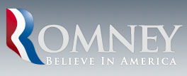
Really enjoyed this link that my friend KPP sent on the new Romney for president logo.
Two things struck me.
First, when the goal is trying to please everybody, the end result is almost always milquetoast – and this logo certainly proves that point. A designer friend, Cornelia, came up with this interpretation:

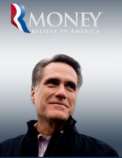
Second, is that a quick look at the font treatment of “OMNEY” and it can read as “MONEY” (and not only for the dyslexics in the crowd). Sadly, the way the system works these days, it is only because of the fact that he has personal heaps of money is why he gets to do what he does in the public arena. So this is my take on it:

So there you go, MONEY for President. Anybody have any good ideas on the tag line?
